Azahub
Azahub
Azahub is a software development company that underwent a rebranding process. The project's focus was on creating a fresh and modern brand identity that reflected the company's innovative and dynamic nature.
Azahub is a software development company that underwent a rebranding process. The project's focus was on creating a fresh and modern brand identity that reflected the company's innovative and dynamic nature.
Overview
Overview
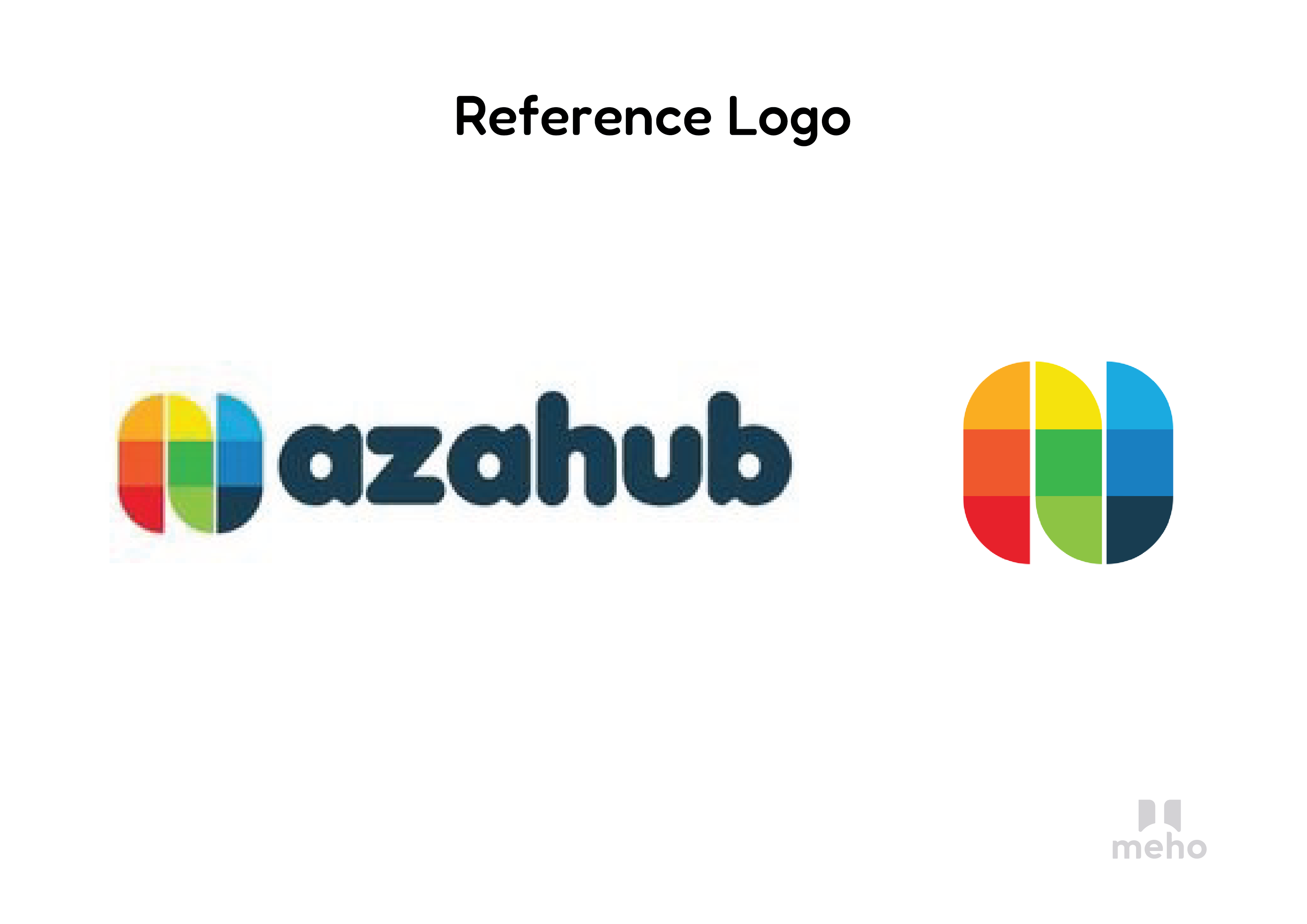
The Azahub logo effectively communicates the brand’s identity as an innovative and dynamic software development company. Its modern design and vibrant colors enhance brand recognition and appeal within the tech industry
The Azahub logo effectively communicates the brand’s identity as an innovative and dynamic software development company. Its modern design and vibrant colors enhance brand recognition and appeal within the tech industry
Design Elements
Shapes: The logo uses rounded and bold shapes, giving it a modern and approachable look.
Colour: A vibrant color palette with blue, green, yellow, and red, representing diversity, innovation, and creativity.
Typography: The font is smooth and rounded, reflecting friendliness and accessibility.
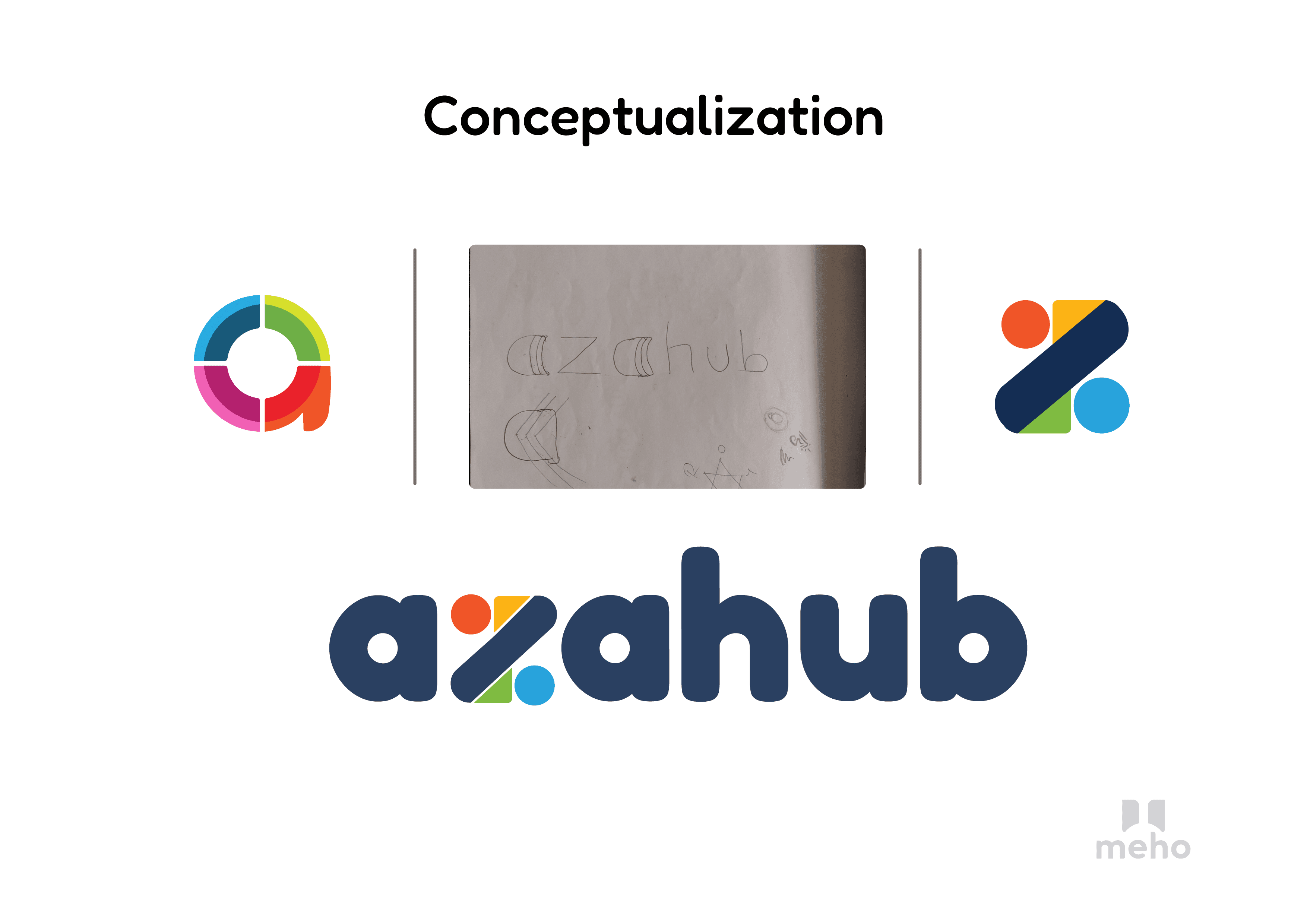
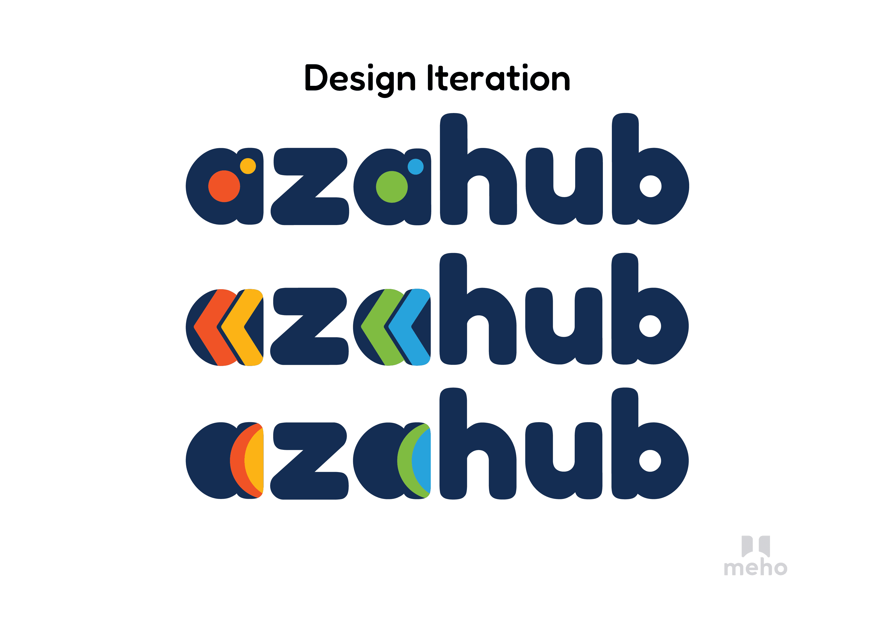
Conceptualization
Symbolism: The use of multi-colored segments signifies the diverse and dynamic nature of Azahub’s services.
Iteration Process: Various designs were conceptualized and refined, focusing on simplicity and recognizability.
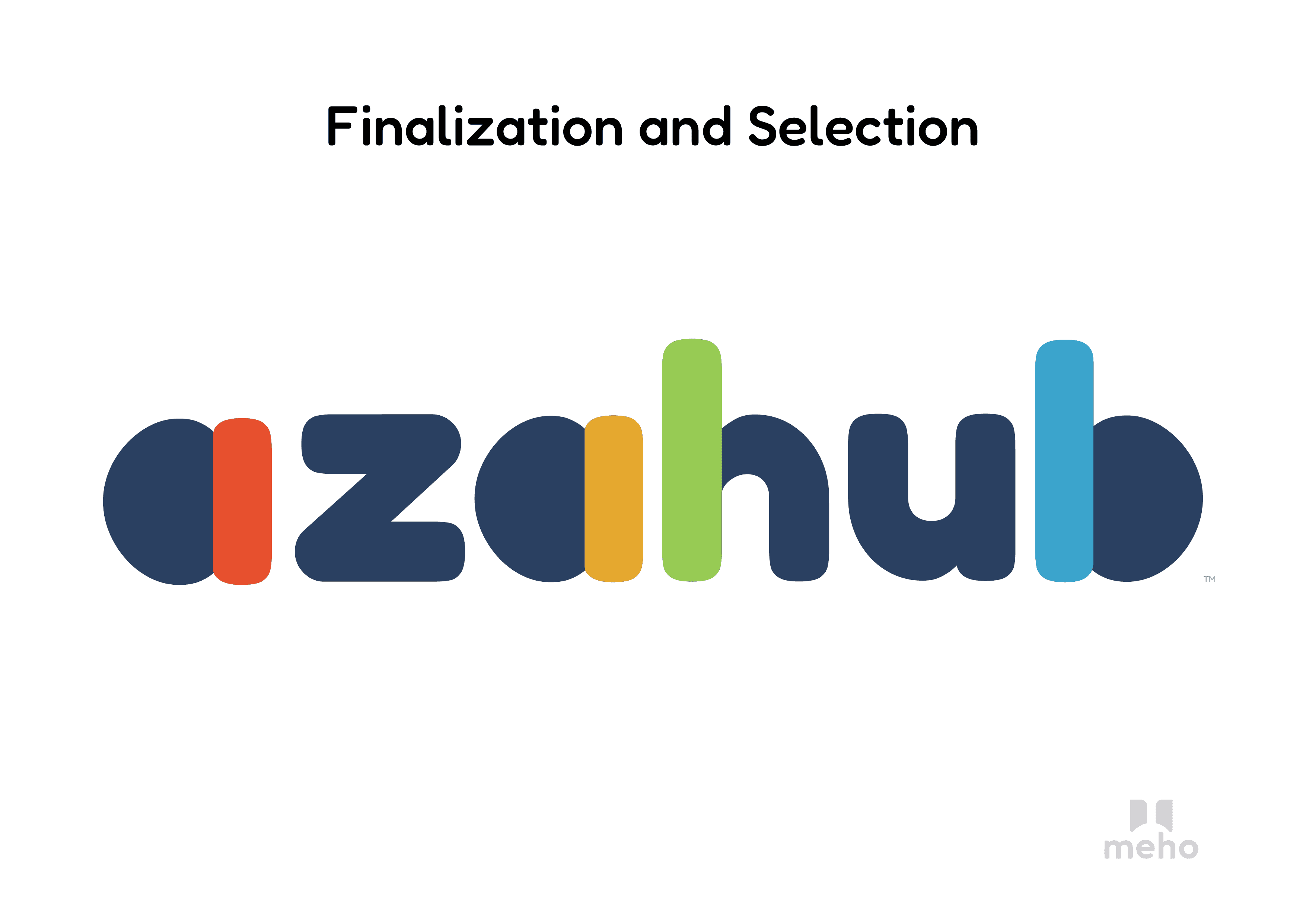
Finalization
Versatility: The finalized logo is adaptable across different mediums, ensuring consistency in branding.
Recognition: The vibrant colors and bold design make the logo easily recognizable and memorable.
Design Elements
Shapes: The logo uses rounded and bold shapes, giving it a modern and approachable look.
Colour: A vibrant color palette with blue, green, yellow, and red, representing diversity, innovation, and creativity.
Typography: The font is smooth and rounded, reflecting friendliness and accessibility.
Conceptualization
Symbolism: The use of multi-colored segments signifies the diverse and dynamic nature of Azahub’s services.
Iteration Process: Various designs were conceptualized and refined, focusing on simplicity and recognizability.
Finalization
Versatility: The finalized logo is adaptable across different mediums, ensuring consistency in branding.
Recognition: The vibrant colors and bold design make the logo easily recognizable and memorable.
Complete Rebranding
Logo redesign
Brand messaging refinement
Brand style guide creation