TYPNI
TYPNI
TYPNI is a youth organization that required a dynamic and engaging brand identity. The project involved creating a logo that reflects the organization's mission to foster innovation, networking, and engagement among young people. The design process focused on conveying a sense of inclusivity and energy.
TYPNI is a youth organization that required a dynamic and engaging brand identity. The project involved creating a logo that reflects the organization's mission to foster innovation, networking, and engagement among young people. The design process focused on conveying a sense of inclusivity and energy.
Overview
Overview
The TYPNI logo effectively communicates the organization's mission and values through its modern design and vibrant colors. The geometric typeface and shapes enhance the logo's appeal and recognizability, making it a strong visual identity for the youth organization.
The TYPNI logo effectively communicates the organization's mission and values through its modern design and vibrant colors. The geometric typeface and shapes enhance the logo's appeal and recognizability, making it a strong visual identity for the youth organization.
Design Elements
Typography: The logo uses a sans-serif geometric typeface, reflecting modernity, openness, and approachability.
Colours: The vibrant color palette symbolizes energy, inclusivity, and creativity, aligning with the organization's values.
Shapes: Geometric shapes and circles are incorporated to represent connectivity and balance.
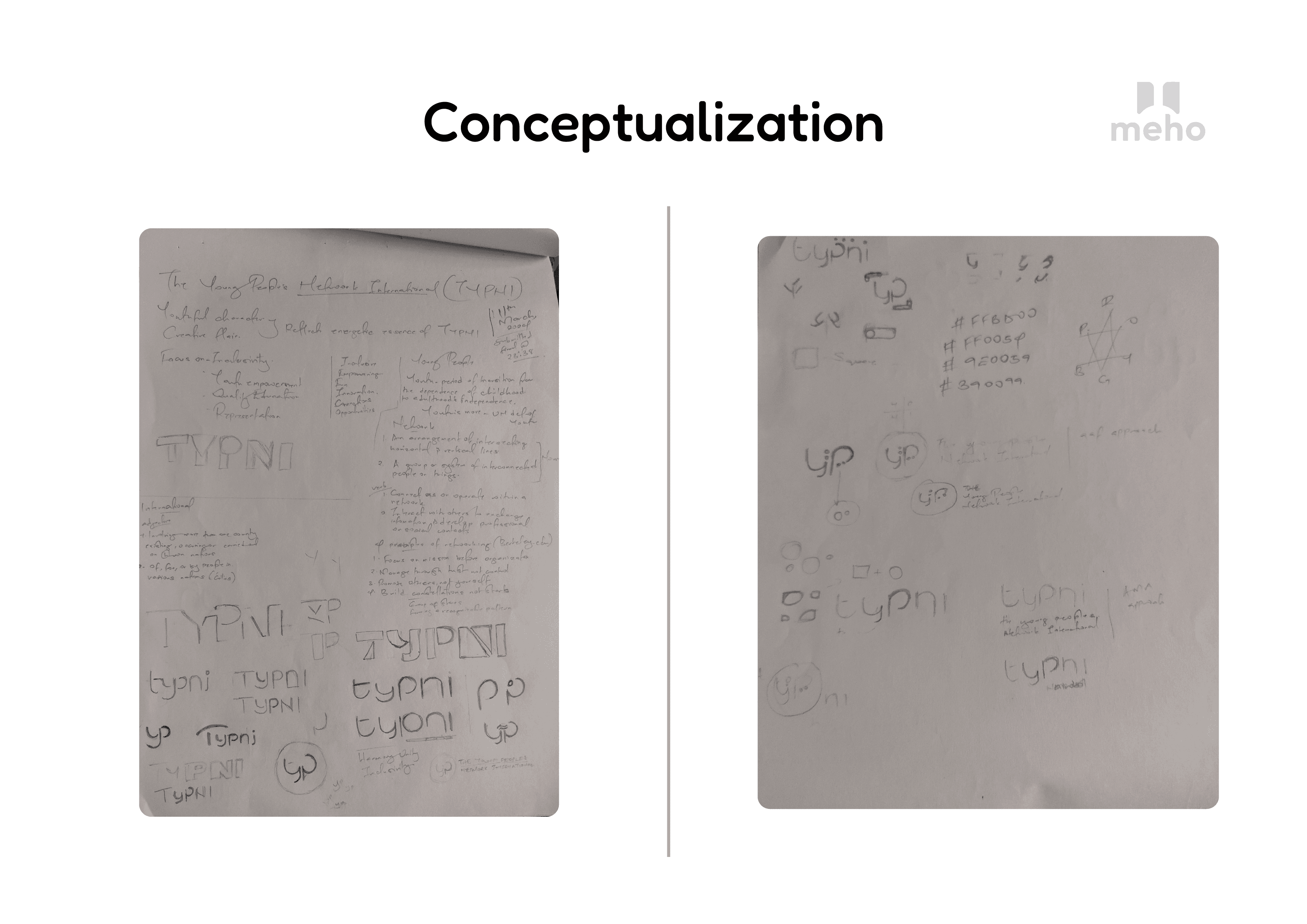
Conceptulization
Inspiration: The design was inspired by the principles of networking and youth empowerment.
Sketches: Initial sketches explored various typographic treatments and geometric elements to capture the essence of TYPNI.
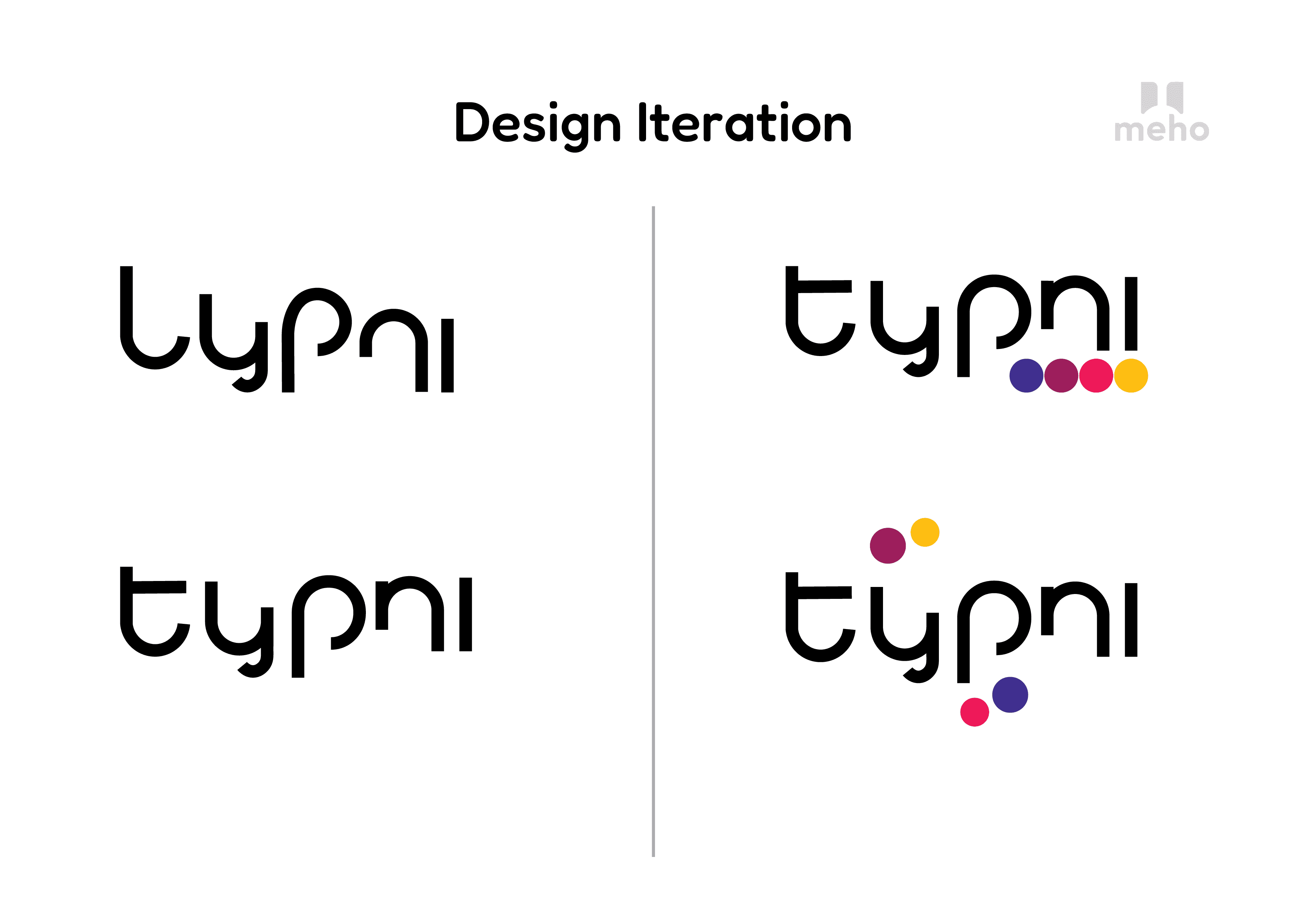
Design Iteration
Refinement: Multiple iterations were made to refine the logo, focusing on clarity and visual appeal.
Variations: Different variations of the logo were tested to ensure versatility and recognizability.
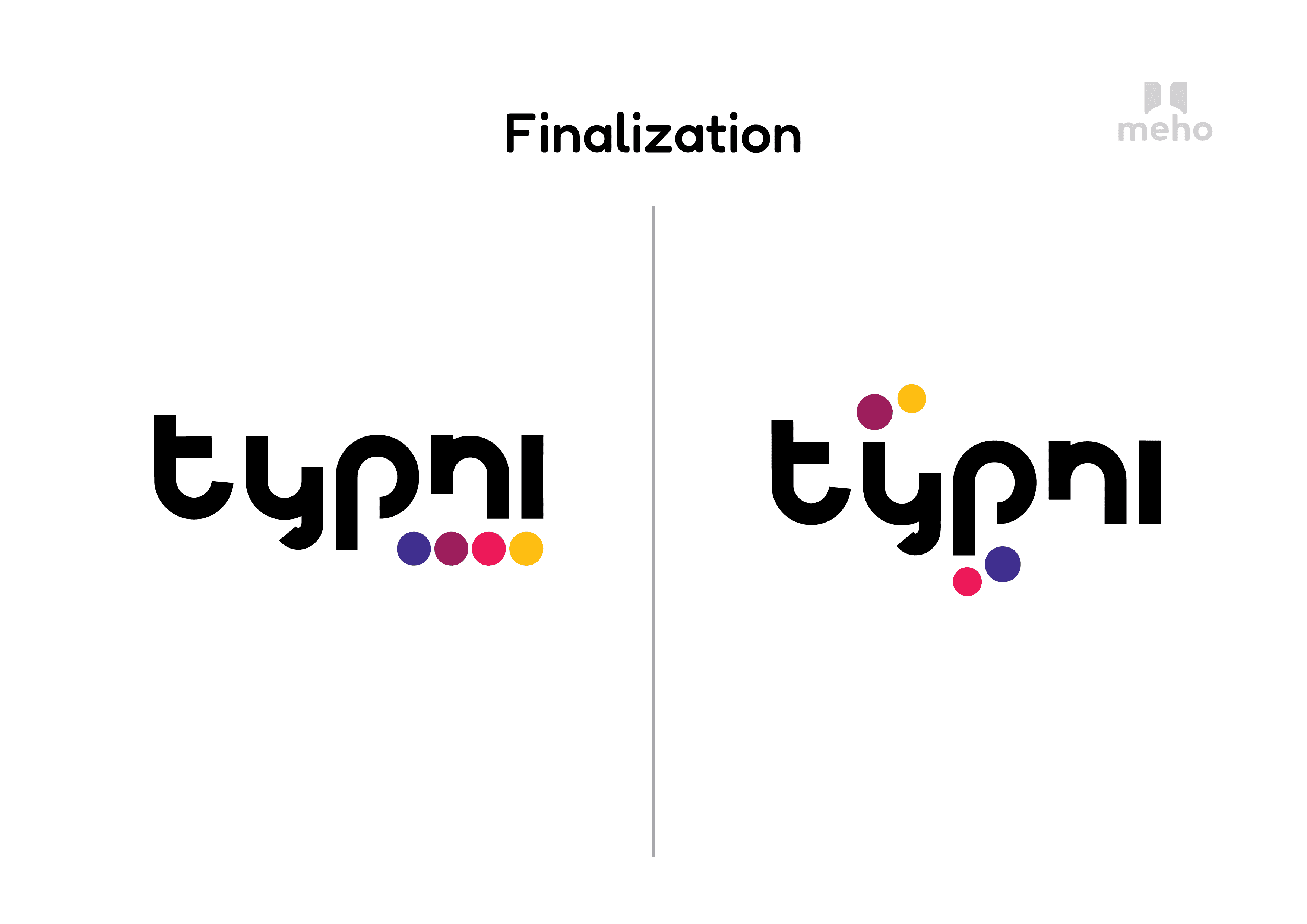
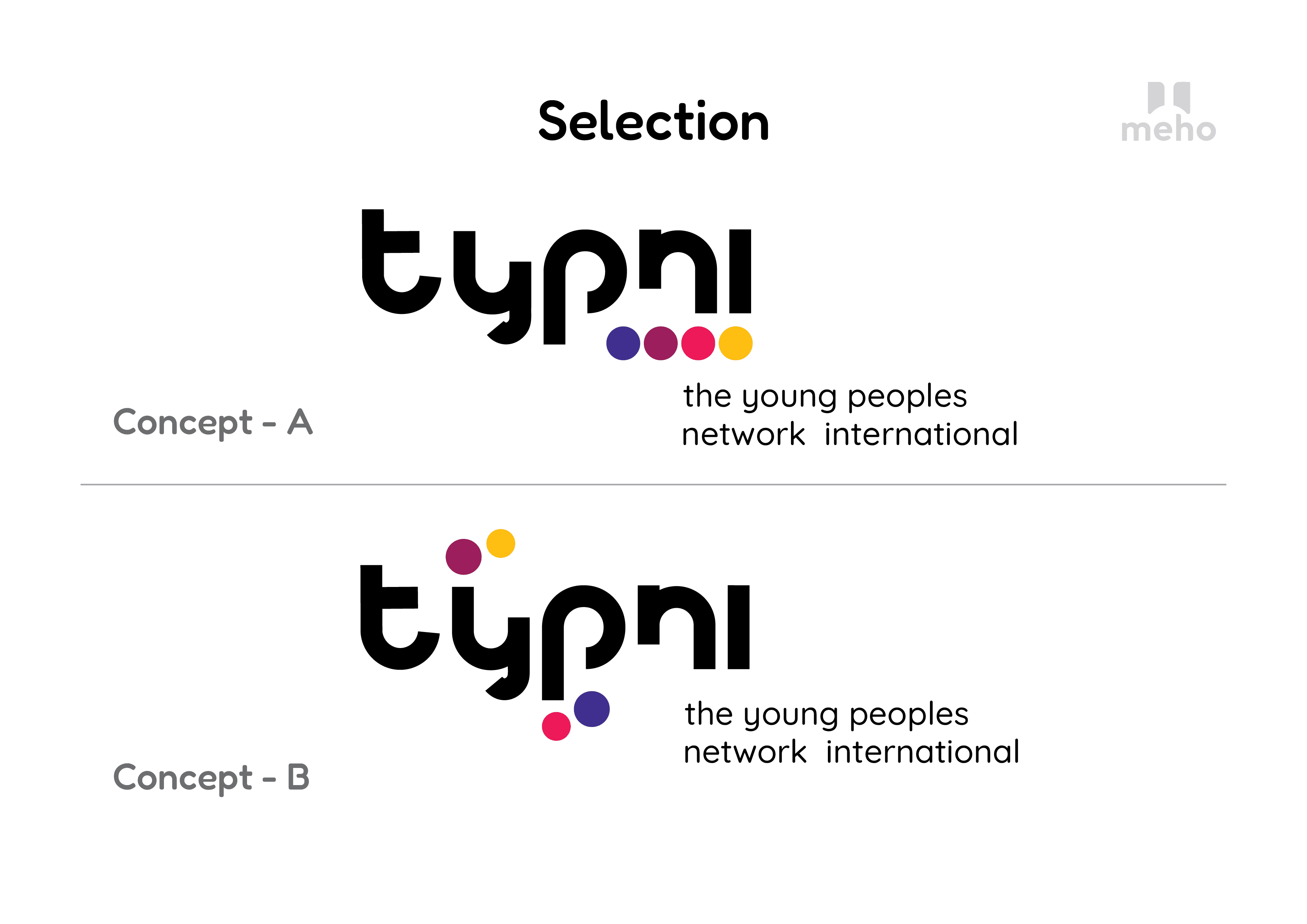
Finalization
Selection: The final logo combines vibrant colors and geometric shapes to create a dynamic and modern visual identity.
Versatility: The logo is designed to be adaptable across various media and applications.
Design Elements
Typography: The logo uses a sans-serif geometric typeface, reflecting modernity, openness, and approachability.
Colours: The vibrant color palette symbolizes energy, inclusivity, and creativity, aligning with the organization's values.
Shapes: Geometric shapes and circles are incorporated to represent connectivity and balance.
Conceptulization
Inspiration: The design was inspired by the principles of networking and youth empowerment.
Sketches: Initial sketches explored various typographic treatments and geometric elements to capture the essence of TYPNI.
Design Iteration
Refinement: Multiple iterations were made to refine the logo, focusing on clarity and visual appeal.
Variations: Different variations of the logo were tested to ensure versatility and recognizability.
Finalization
Selection: The final logo combines vibrant colors and geometric shapes to create a dynamic and modern visual identity.
Versatility: The logo is designed to be adaptable across various media and applications.
Logo design
Positioning
Text Styles
Colors Style